Creating a neat little highlighter/transition effect with Stimulus.js
Remember the good old days when everyone used jQuery and you could use the highlight function to have a newly inserted item flash yellow and then fade out? I thought I’d see if I could replicate that using the new target connected and disconnected callback feature of stimulus.js 3.0. This could be useful with hotwire when you’re dynamically inserting elements on the page without a full page reload.
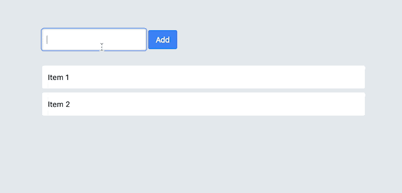
This is what we’ll be creating
What is a target callback?
A target callback is a function that gets called when an element is added or removed from the DOM read more here.
Let’s look at this simple example. First some simple HTML where we call a stimulus.js controller named highlight and have a target named item:
<div data-controller="highlight">
  <div data-highlight-target="item">
    My first item
  </div>
  <div data-highlight-target="item">
    My second item
  </div>
</div>
A simple stimulus controller could look like
import { Controller } from "@hotwired/stimulus"

export default class extends Controller {
  static targets = ["item"]

  itemTargetConnected(element) {
    element.classList.add("bg-yellow-200")

    setTimeout(() => {
      element.classList.add(...["transition-colors", "ease-in-out", "duration-700", "bg-transparent"])
    }, 500)
  }
}
In the above - for simplicity’s sake - we rely on tailwindcss, but you could spin up your own css classes mimicking what this does.
When the DOM is first laoded and the stimulus controller initializes, it’ll fire the itemTargetConnected callback for all the items on the page. First it adds a bg-yellow-200 class to the
element which makes the background yellow. Then inside the setTimeout function, we add the transition classes, which describes what css attributes we want to transition as well as the duration and what
we want to transition to - in this case a transparent background (bg-transparent). Those classes will be added after the 500ms timeout.
What’s next?
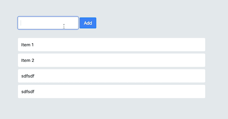
If you load your page now, all targets already in the DOM will have the highlighter effect on them. This is not exactly what we want, we only want it to apply to newly inserted items.
Let’s add a connected variable which we’ll set to false initially. Add that just below the static targets ... line like so:
import { Controller } from "@hotwired/stimulus"

export default class extends Controller {
  static targets = ["item"]

  connected = false

  itemTargetConnected(element) {
    element.classList.add("bg-yellow-200")

    setTimeout(() => {
      element.classList.add(...["transition-colors", "ease-in-out", "duration-700", "bg-transparent"])
    }, 500)
  }
}
Then we can add the connect() function and set the connected variable to true and inside itemTargetConnected we’ll return if the value is false. So we’ll end up with a controller that looks like this:
import { Controller } from "@hotwired/stimulus"

export default class extends Controller {
  static targets = ["item"]

  connected = false

  connect() {
    this.connected = true
  }

  itemTargetConnected(element) {
    if (!this.connected) return;

    element.classList.add("bg-yellow-200")

    setTimeout(() => {
      element.classList.add(...["transition-colors", "ease-in-out", "duration-700", "bg-transparent"])
    }, 500)
  }
}
Very nice! Now only elements that is dynamically inserted in to the DOM after we’ve loaded the page will be highlighted. This is really useful if you use hotwire or insert elements via javascript.
Reusability?
Having just a highlight effect is no fun. What if elements could slide in, or fade in - or whatever you can imagine? Let’s make the controller configurable by making use of the newly added default values feature in Stimulus, read more about that feature here.
Add this static values variable to the top of your controller class:
static values = {
  highlighterClass: { type: String, default: "bg-yellow-200" },
  transitionClasses: { type: Array, default: ["transition-colors", "ease-in-out", "duration-700", "bg-transparent"] },
  highlightOnLoad: { type: Boolean, default: false },
  fadeDelay: { type: Number, default: 500 }
}
As you can see, that sets some different values with types and a default value. These can be accessed in the stimulus controller like so this.highlighterClassValue and so on, you get the idea. This way we can swap out all the hardcoded values in our controller, to something that looks like this:
import { Controller } from "@hotwired/stimulus"

export default class extends Controller {
  static targets = ["item"]
  static values = {
    startClasses: { type: Array, default: ["bg-yellow-200"] },
    endClasses: { type: Array, default: ["transition-colors", "ease-in-out", "duration-700", "bg-transparent"] },
    onLoad: { type: Boolean, default: false },
    delay: { type: Number, default: 500 }
  }

  connected = this.transitionOnLoadValue

  connect() {
    this.connected = true
  }

  itemTargetConnected(element) {
    if (!this.connected) return;

    element.classList.add(...this.transitionStartClassesValue)

    setTimeout(() => {
      element.classList.add(...this.transitionEndClassesValue)
    }, this.transitionDelayValue)
  }
}
Now we can re-use this controller and it’d maybe make more sense to rename it to transition_controller.js instead of highlight. So in our HTML we can now do this:
<div
  data-controller="transition"
  data-transition-start-classes-value='["transform", "translate-x-20"]'
  data-transition-end-classes-value='["transition-all", "translate-x-0"]'
  data-transition-delay-value="100"
>
  <div data-transition-target="item">
    My first item
  </div>
  <div data-transition-target="item">
    My second item
  </div>
</div>
Which will have an effect that looks like this